A systemic approach to the visual identity of a Group
For a holding company and its small network of affiliated businesses, we created a system of rules for designing brands and logotypes.
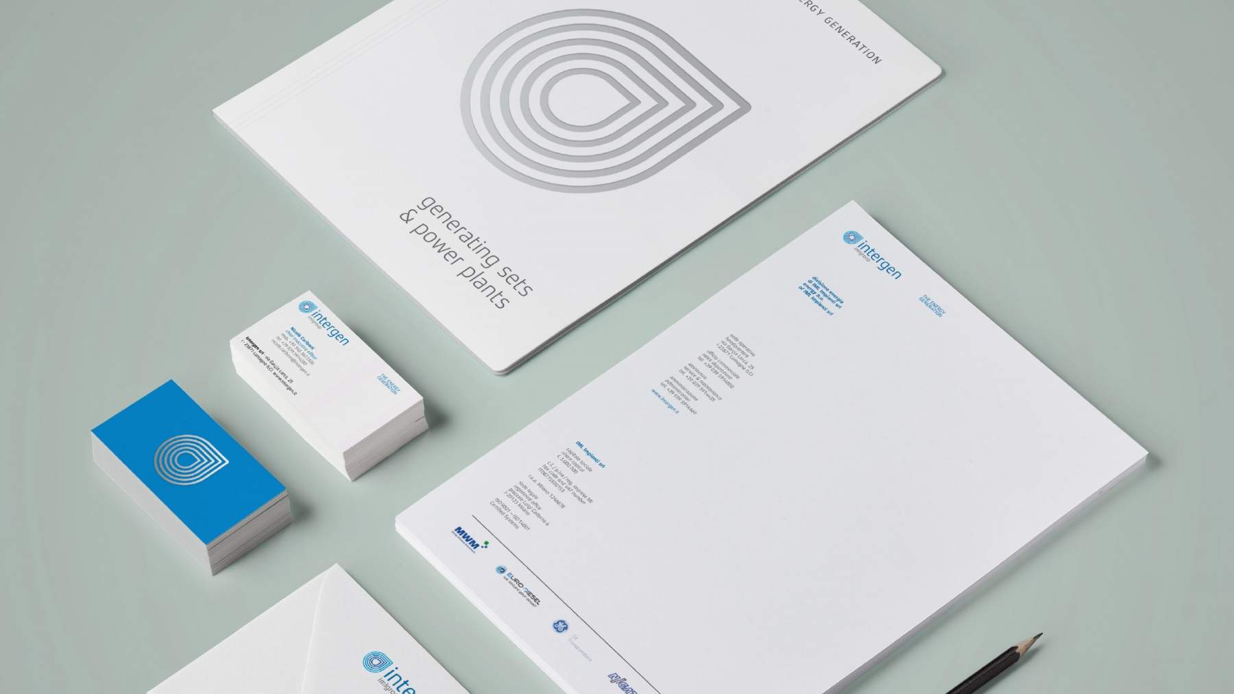
A drop, a flame or a leaf?
Energy or nature?
The answer is 'all of these things together'. The basic shape of the brand generation system is versatile enough to accommodate the signs that identify and distinguish the group's different companies.

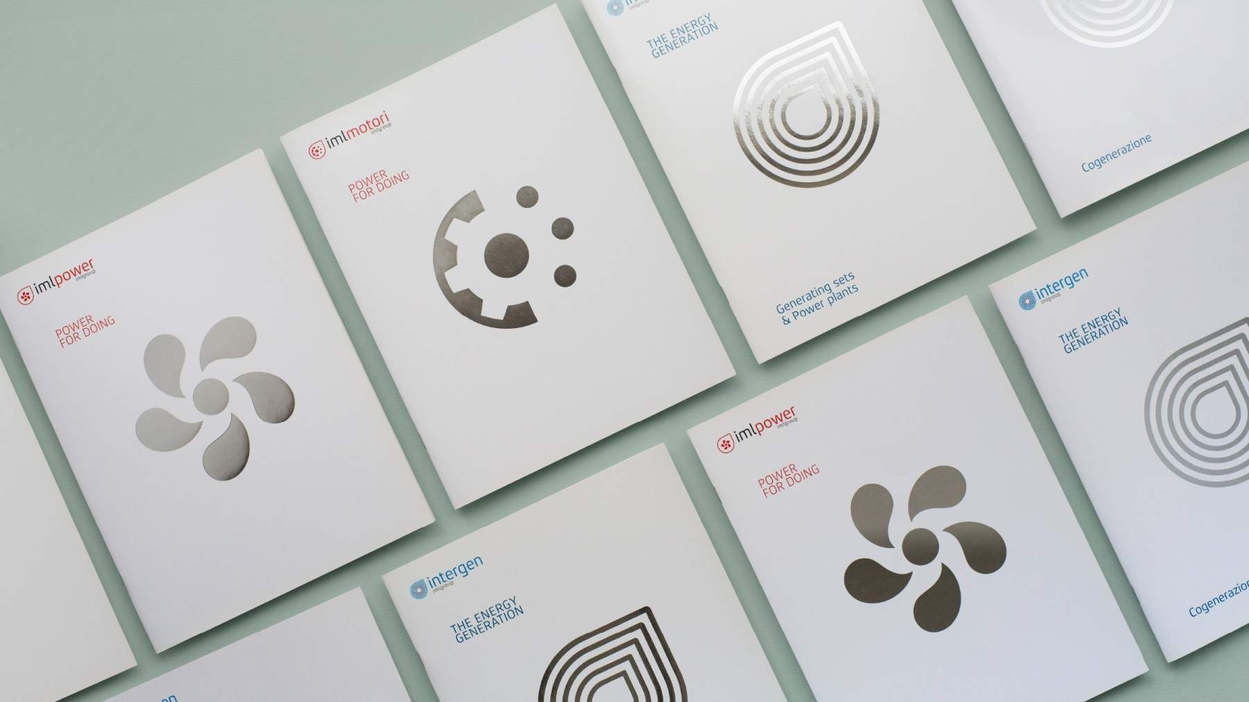
The group's editorial series
In short: the 'red' companies sell and repair engines for industrial vehicles;
the 'blue' companies design and build energy production plants.
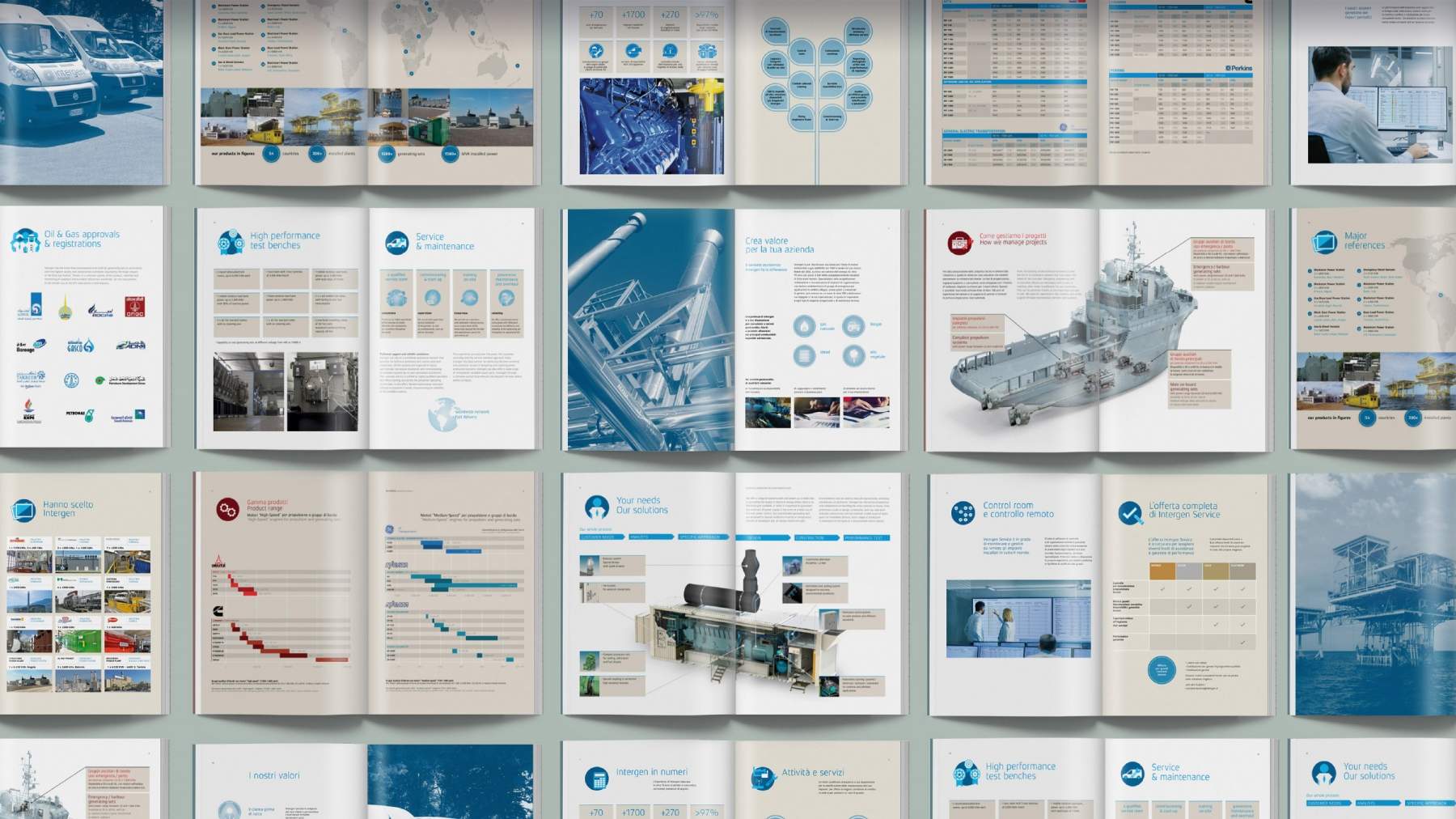
What they have in common: energy transformation and a shared content layout system.
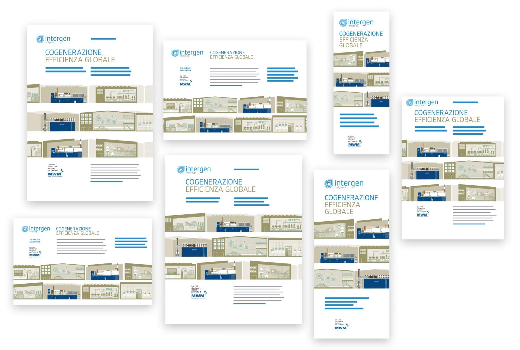
A series of print ads
for the cogeneration sector
Can illustration be both technical and concise at the same time? We gave it a try with this series of visuals, where the images should say roughly this: "We've already made this type of company more efficient, we can do it again, with you too."

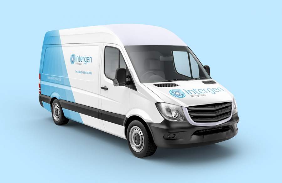
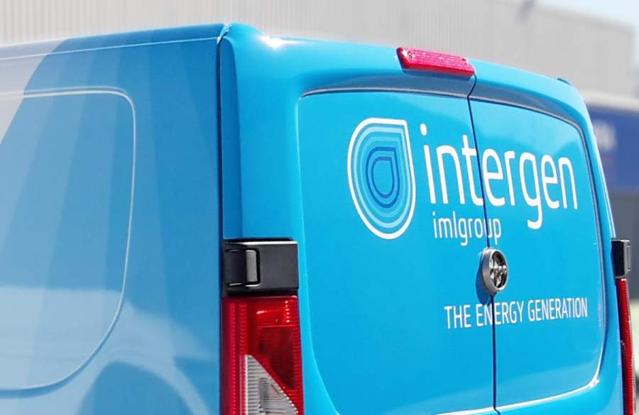
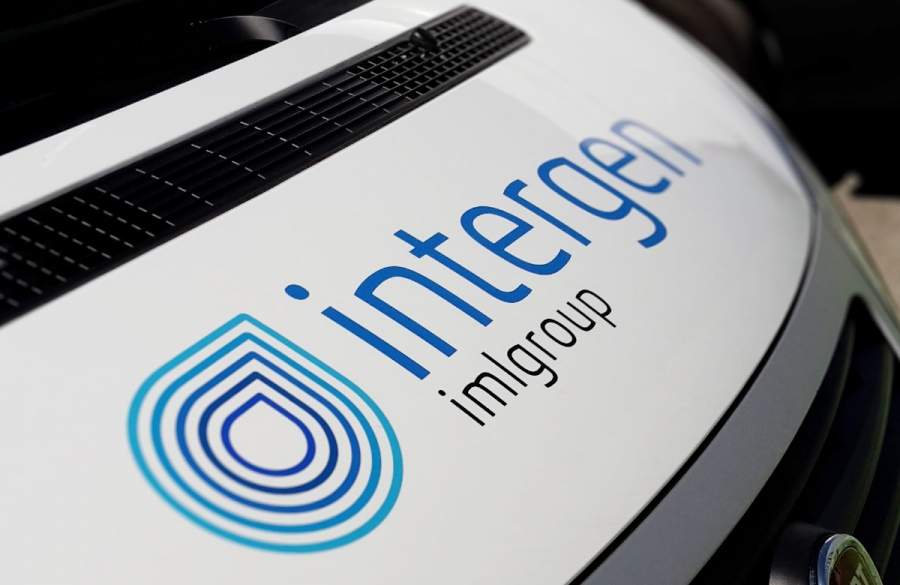
Application across touchpoints
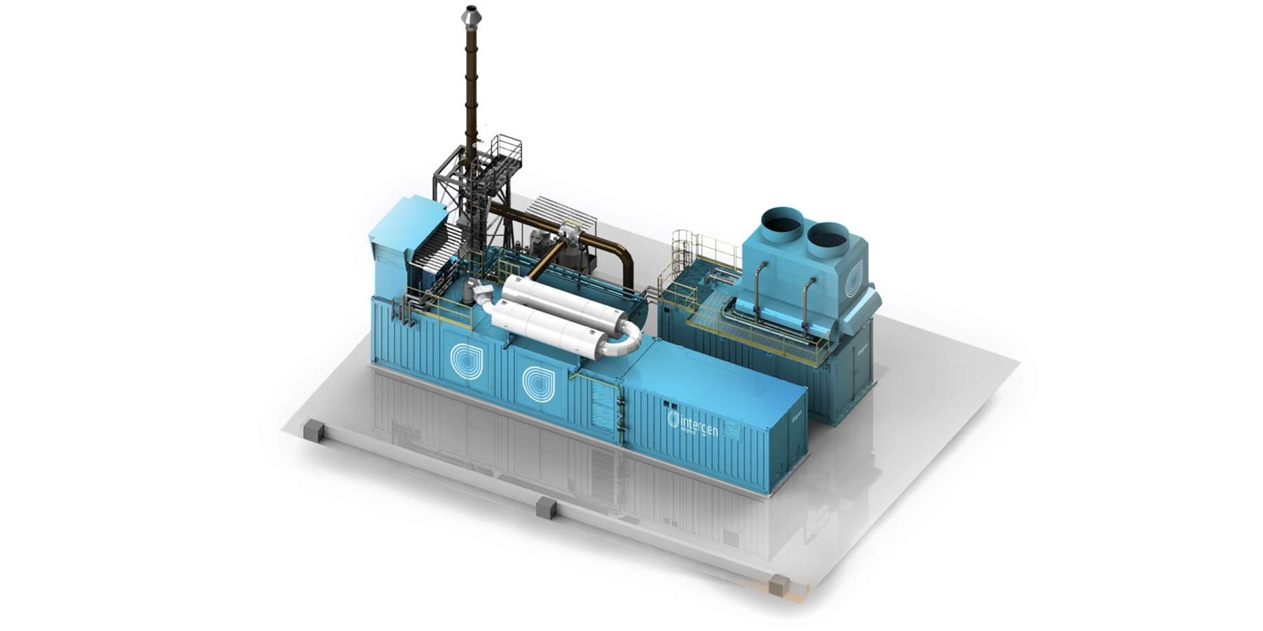
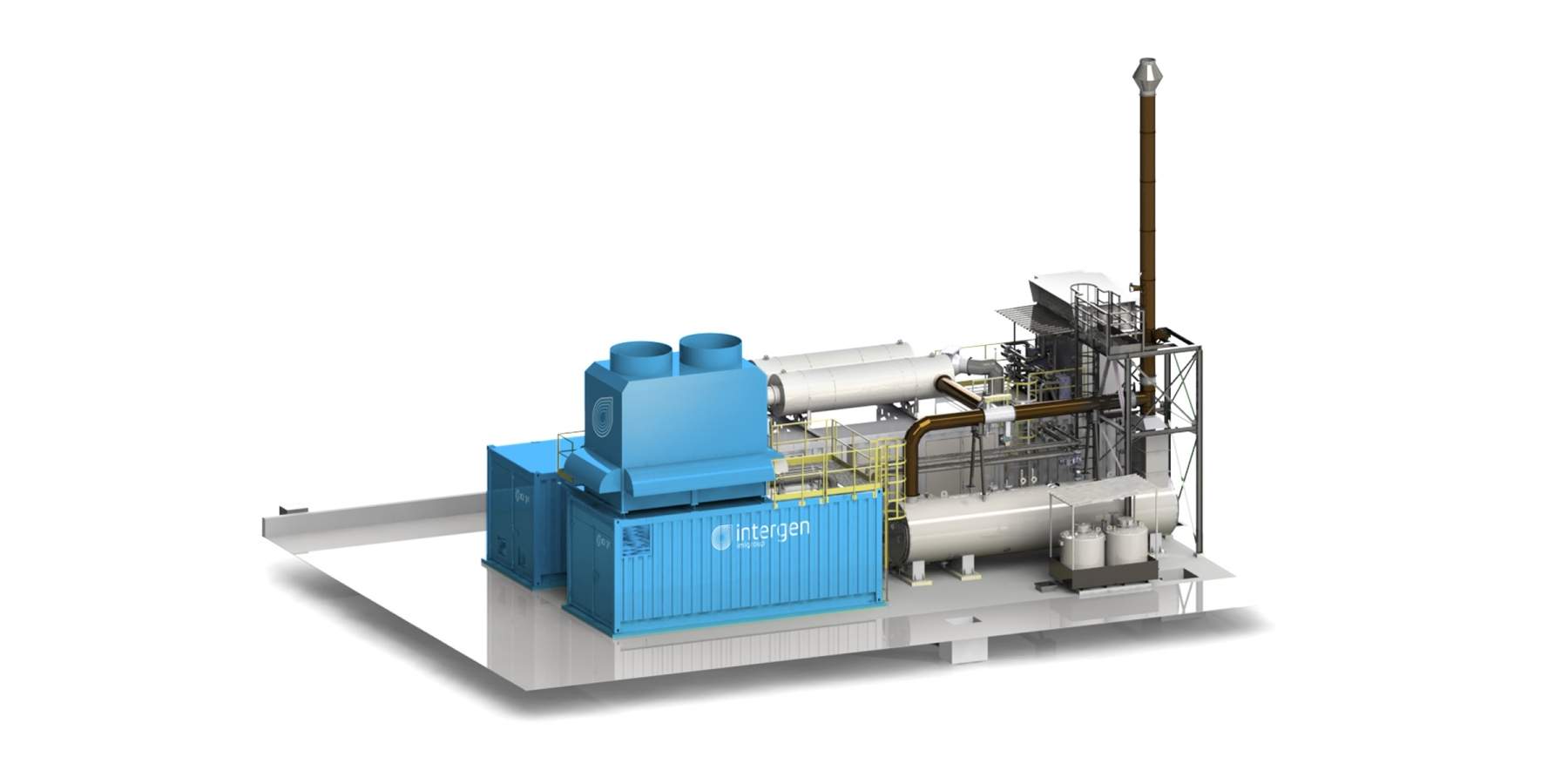
The goal is to make a container identifiable and set it apart from competitors' ones.
The solution is to work on the background color and the size and position of the elements.
The most fun part is adapting the graphics to the corrugated surface of the container.
Fun and effective!

Renderings of generic engines
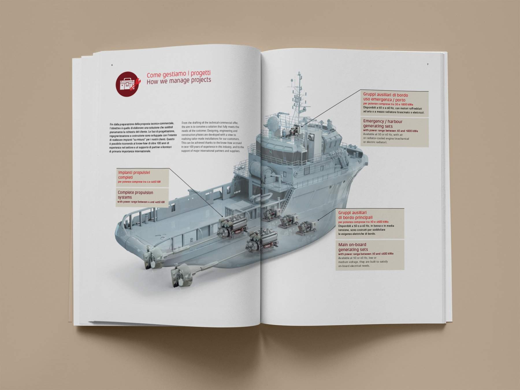
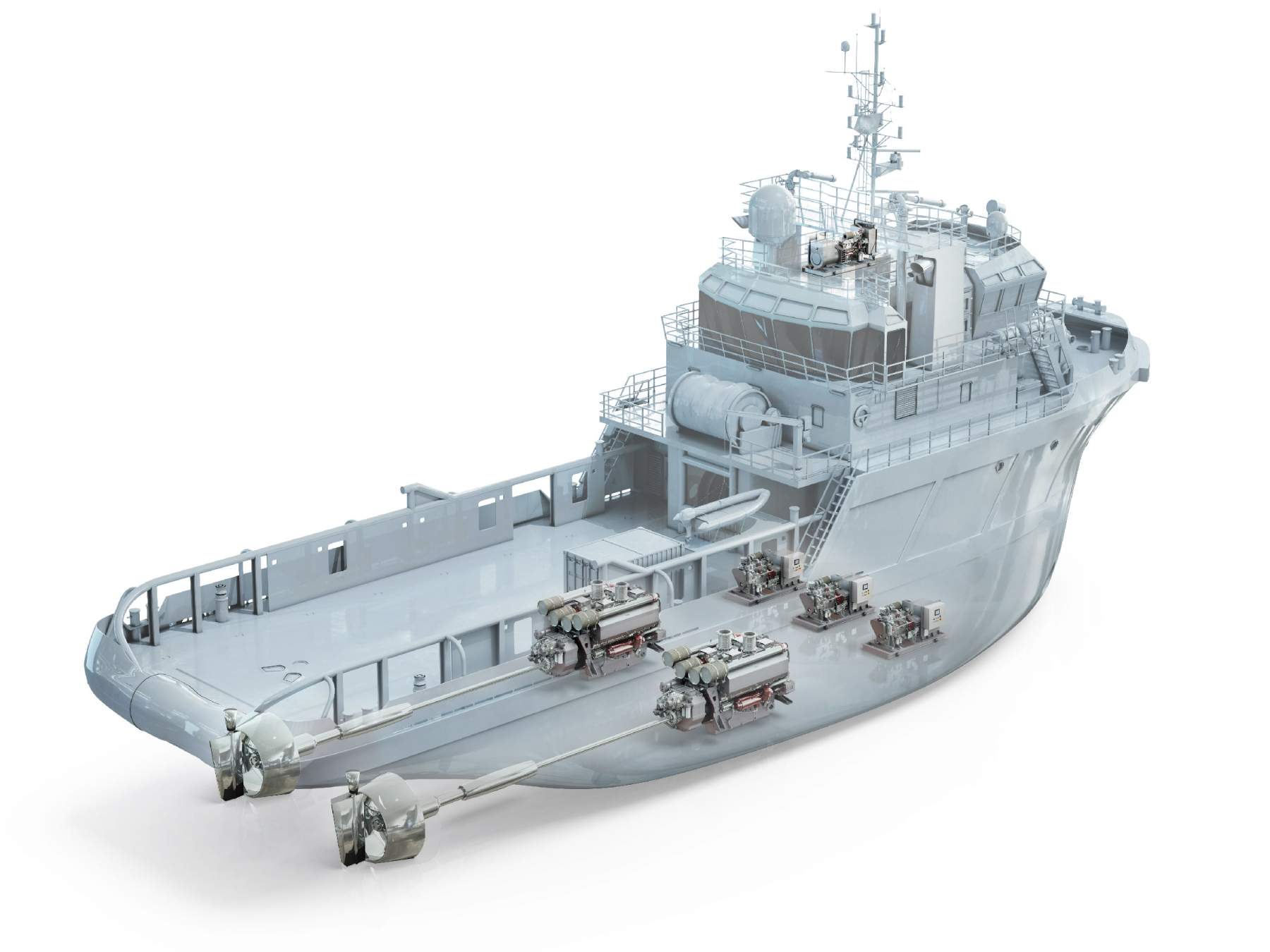
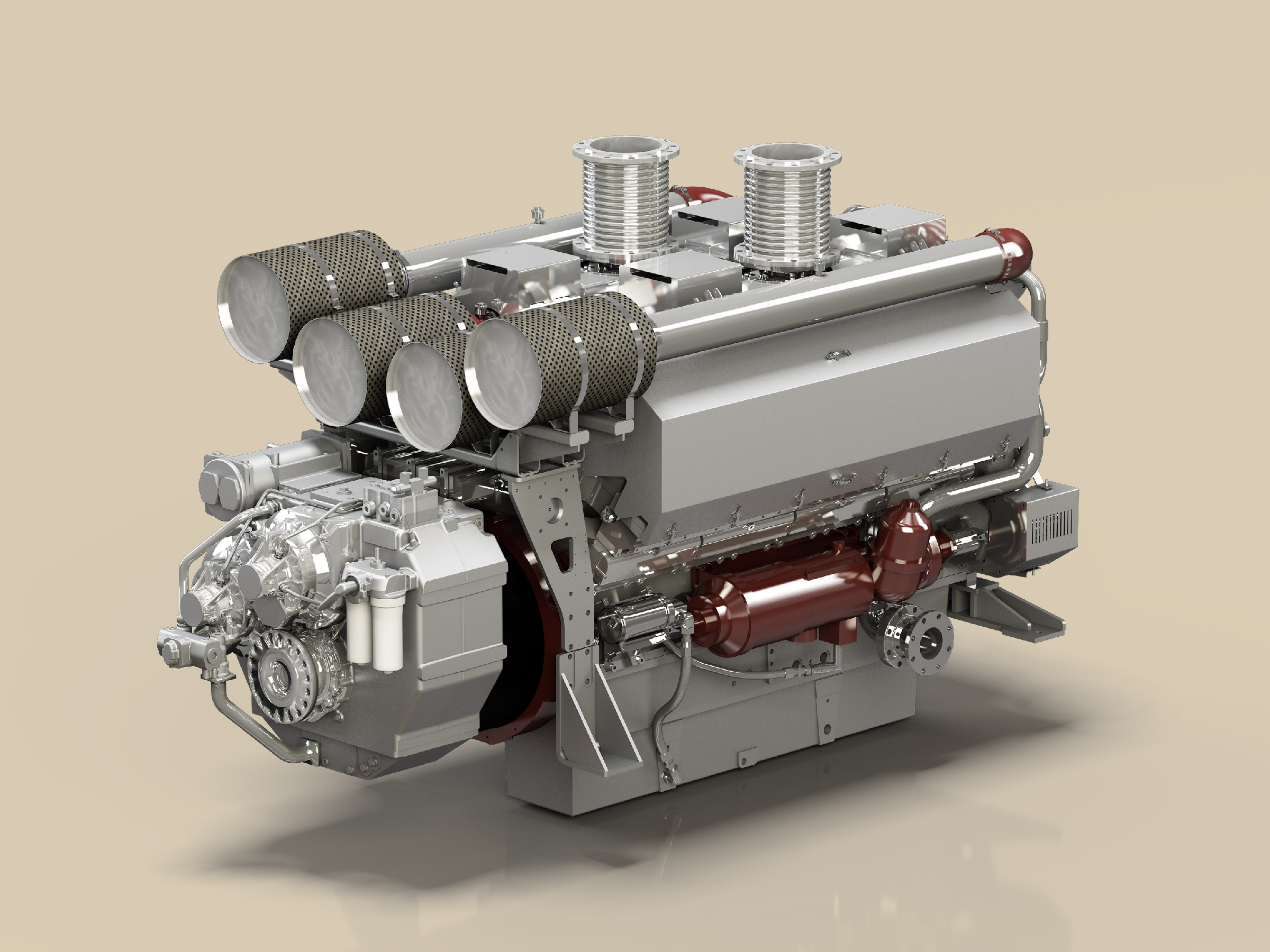
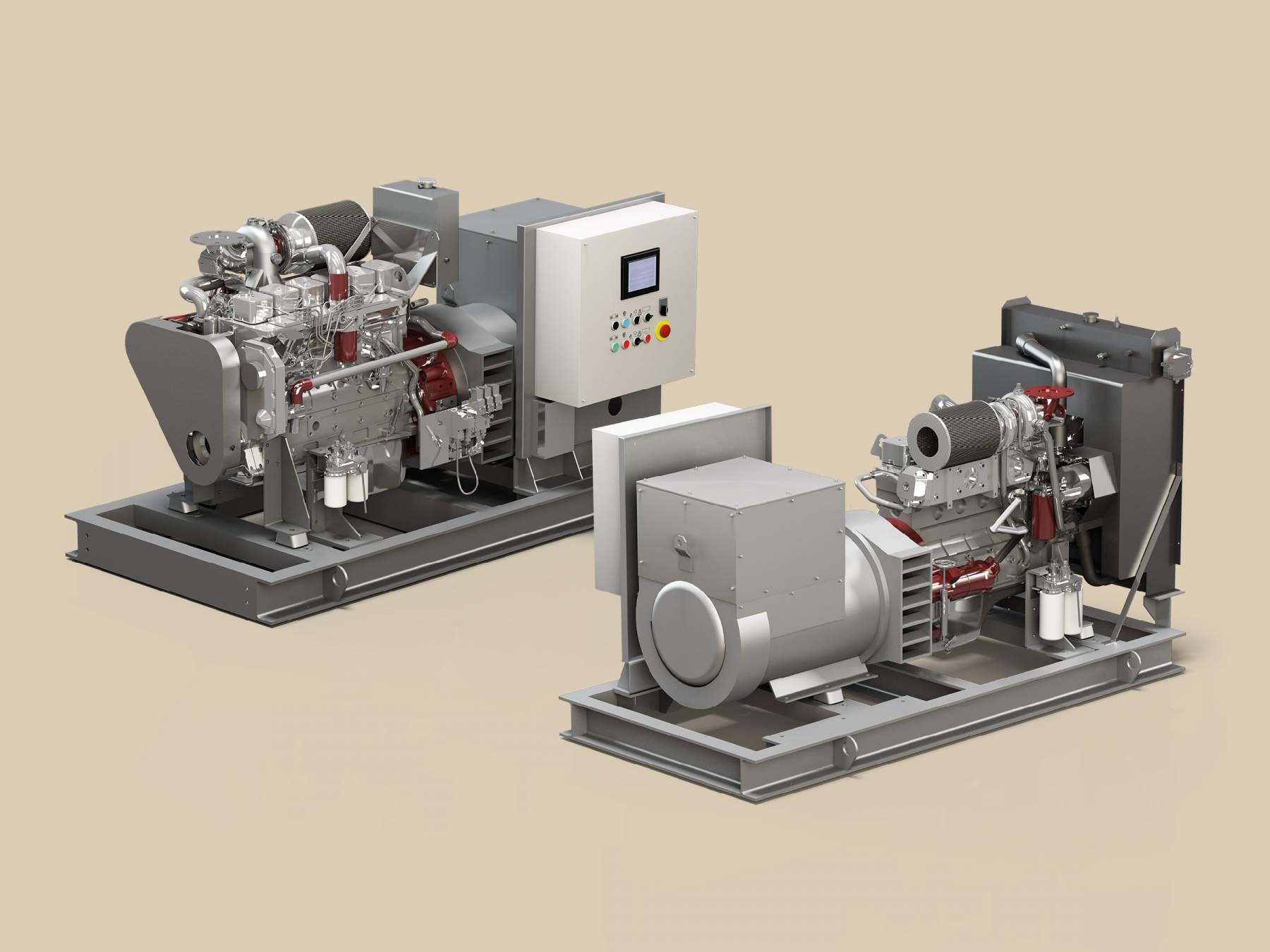
For the marine engines division, we coordinated the production of generic renderings, meaning not tied to a specific manufacturer (so as not to be linked to a supplier that may change over time), but representing the main elements for each engine type.