The visual identity of software
for logistics in the fashion industry
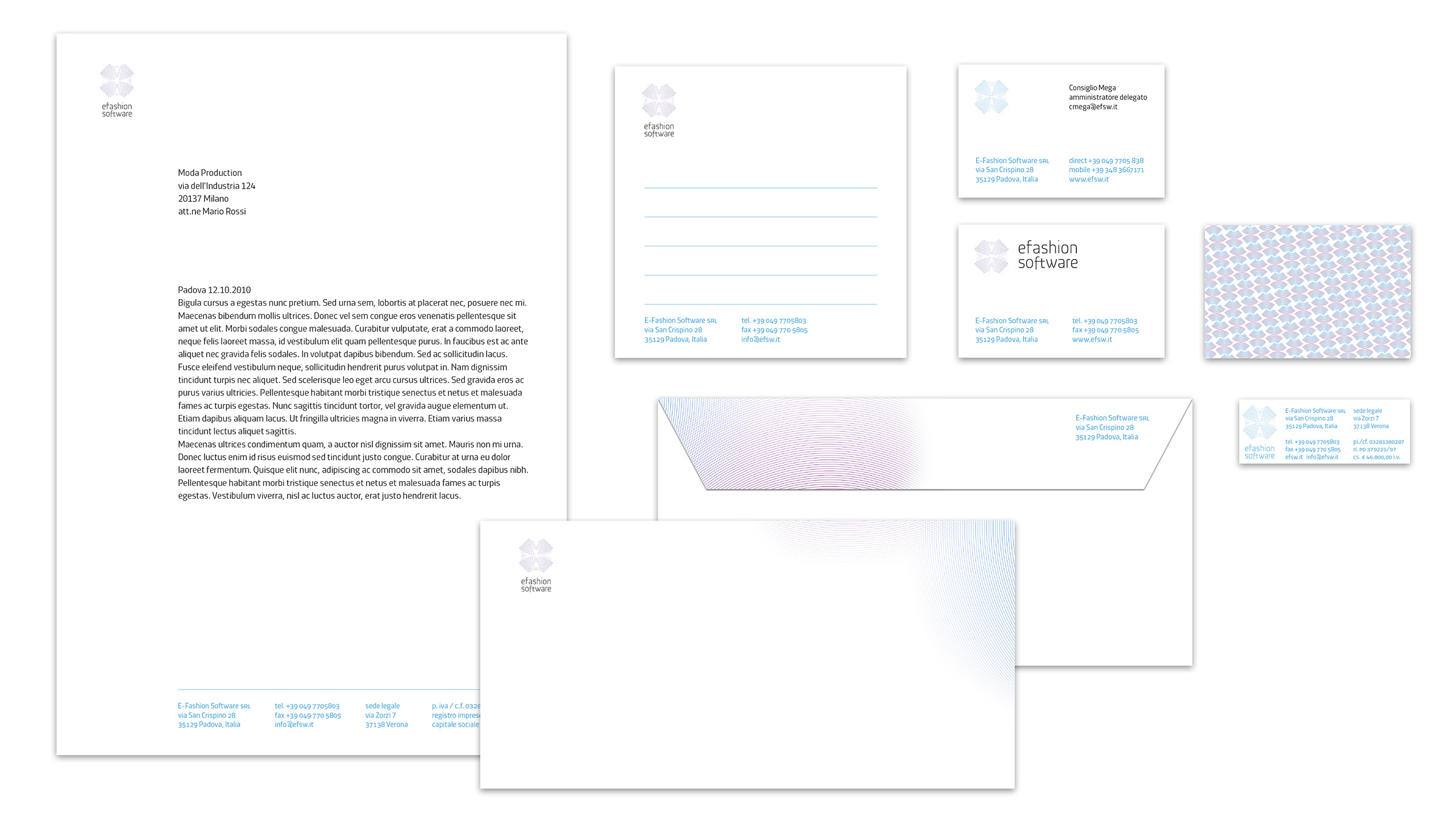
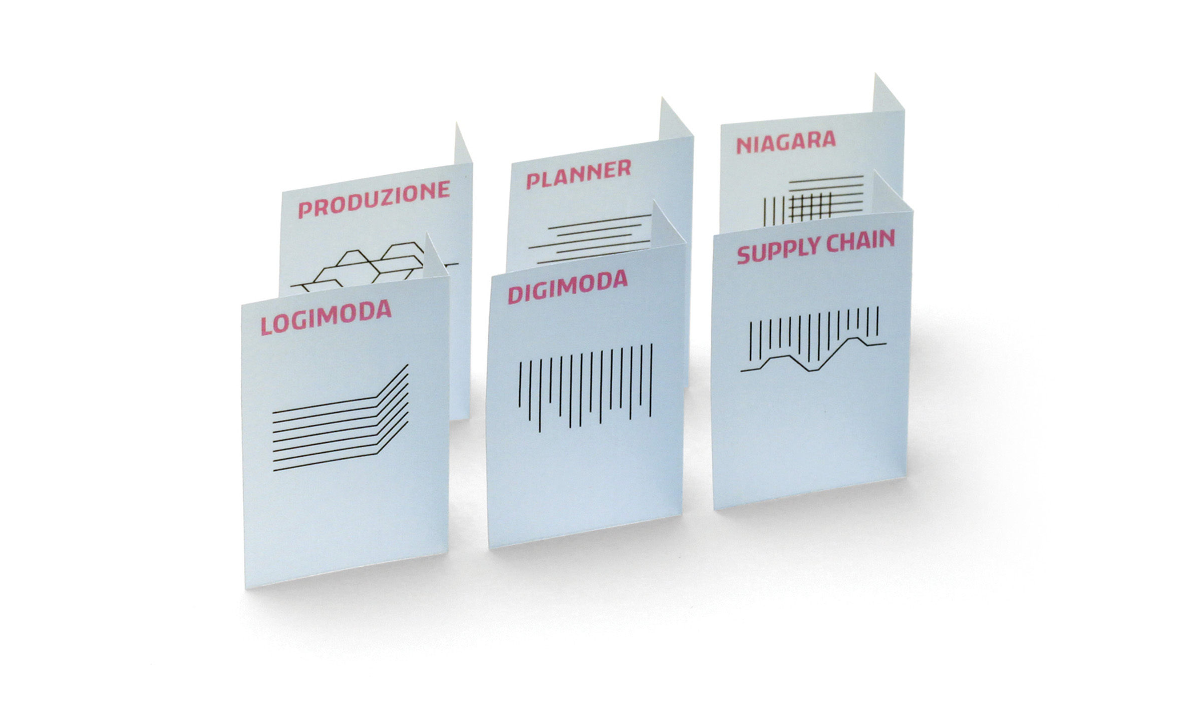
For the company E-Fashion Software, we developed both a corporate identity project and a product identity project, applied to the suite of software developed for fashion companies.
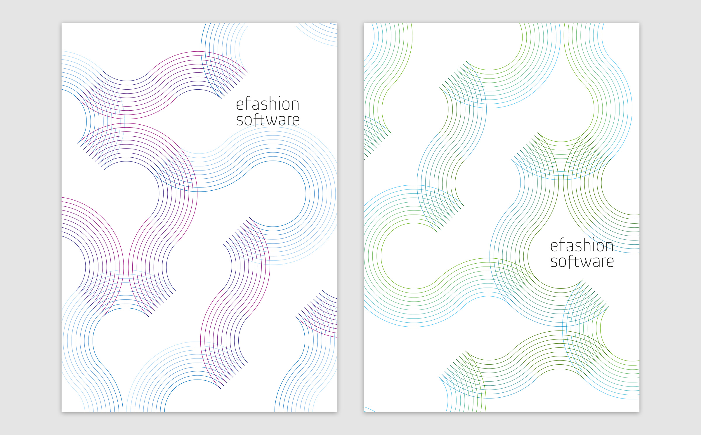
A flower or a ball of yarn? Connections or threads?
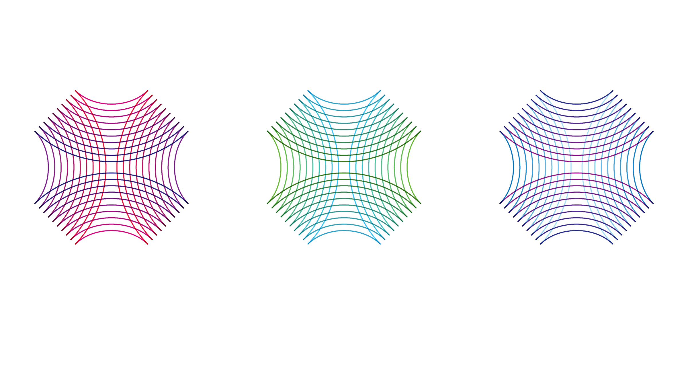
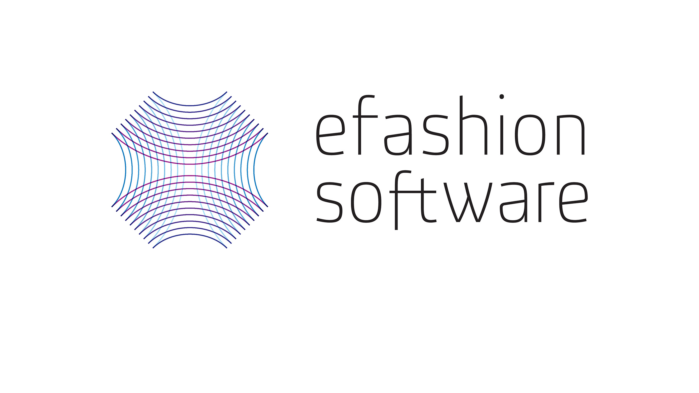
Management software and fashion: two worlds that visually have little in common. It's from exploring the links between these seemingly distant fields that this visual identity project was born. Is it the E-Fashion "flower" blooming, or a "ball" of yarn? Or perhaps the subtle connecting lines between every element of a complex order management and logistics system.

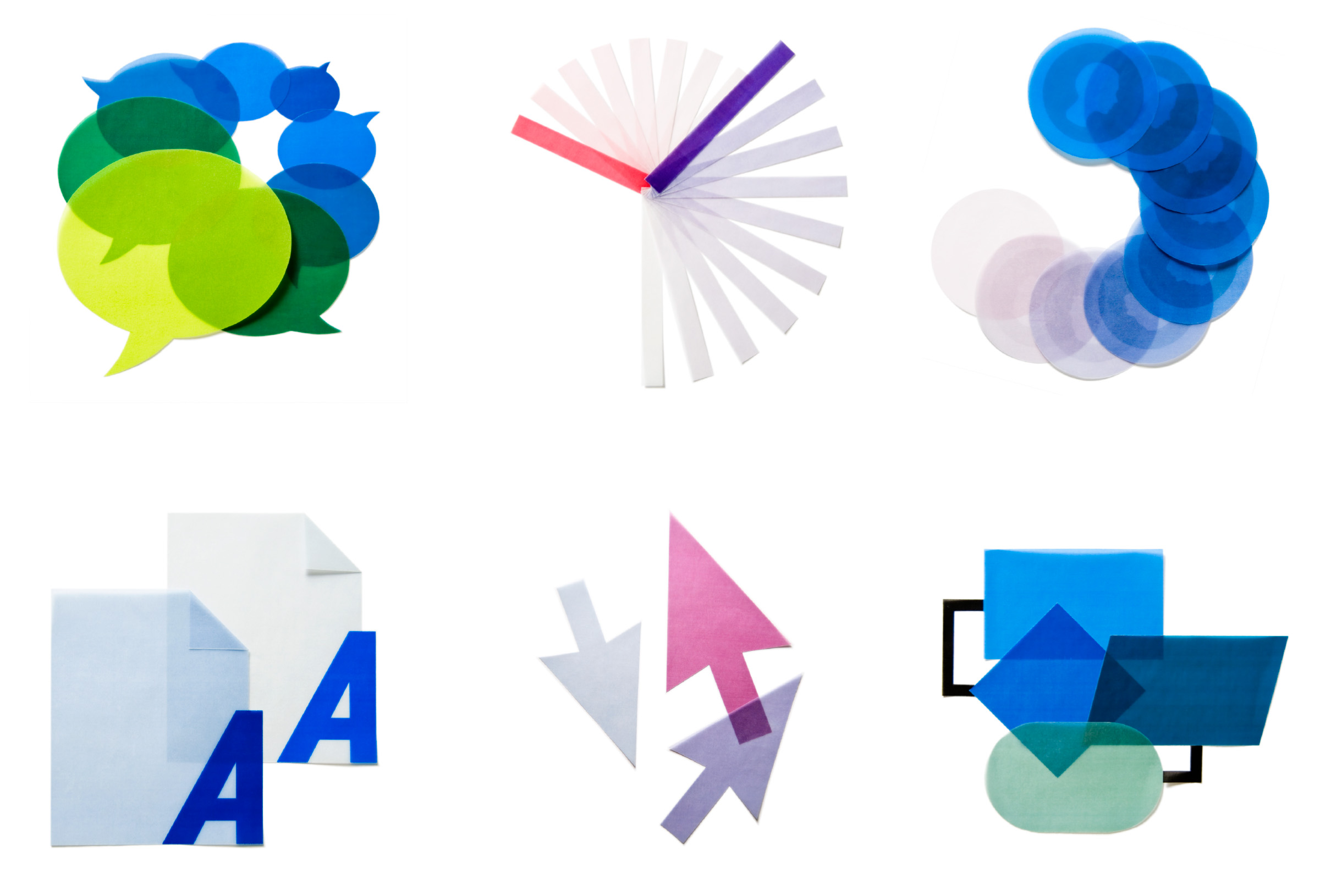
A set of icons made with the logic of haute couture
Alongside the corporate communication, we developed a campaign to promote the Waterfall Suite. It consists of illustrated icons made by hand with paper, glue and scissors, then photographed to give them a tactile quality uncommon in icon design and bring them closer to the worlds of textiles and fashion.
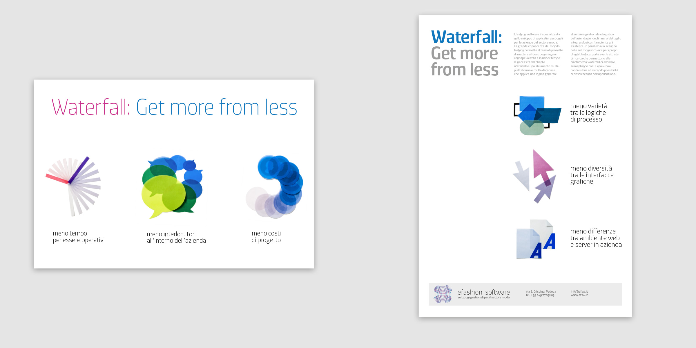
From the launch campaign to the website
We identified several themes for specific audiences, so everyone could find a point of reference connected to their interests. The copywriting brought together two groups of concepts linked by the campaign headline Get more from less. For CEOs, “saving” time, money and contacts becomes “gains” for IT managers, in terms of features.