The visual identity of the Bellini-Mantegna exhibition
An exhibition featuring just two works in dialogue, staged in the spaces of the Fondazione Querini Stampalia in Venice
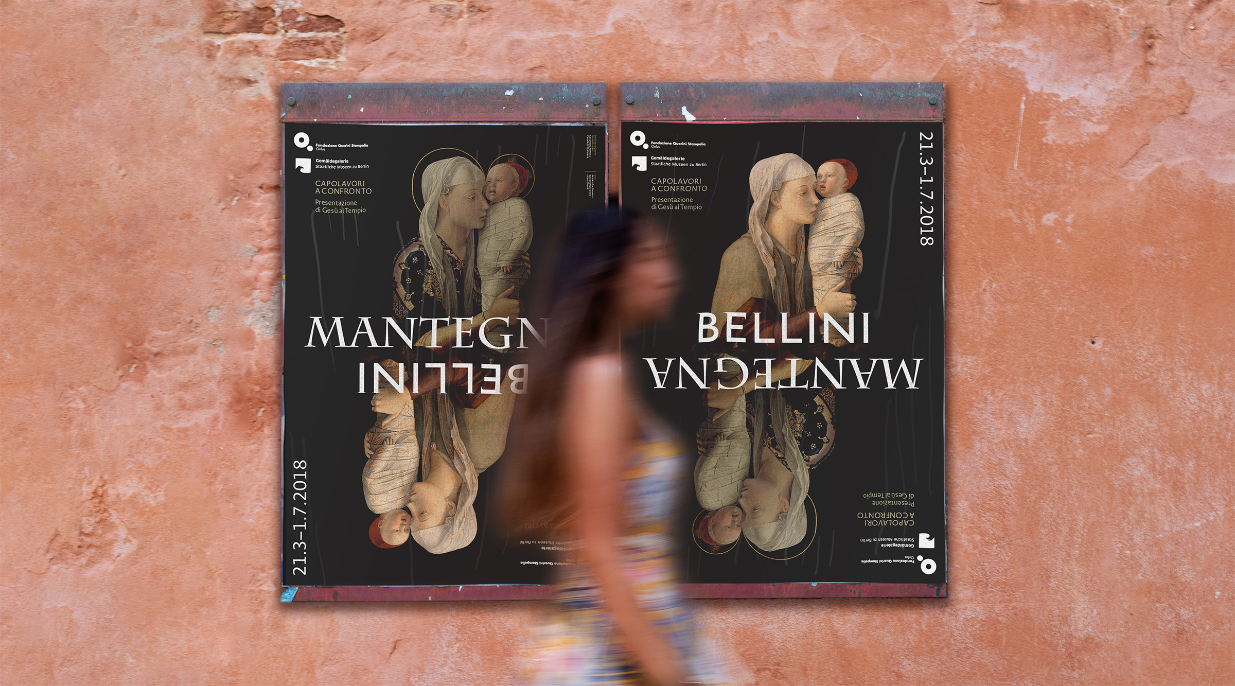
The typographic interpretation
of the two artists
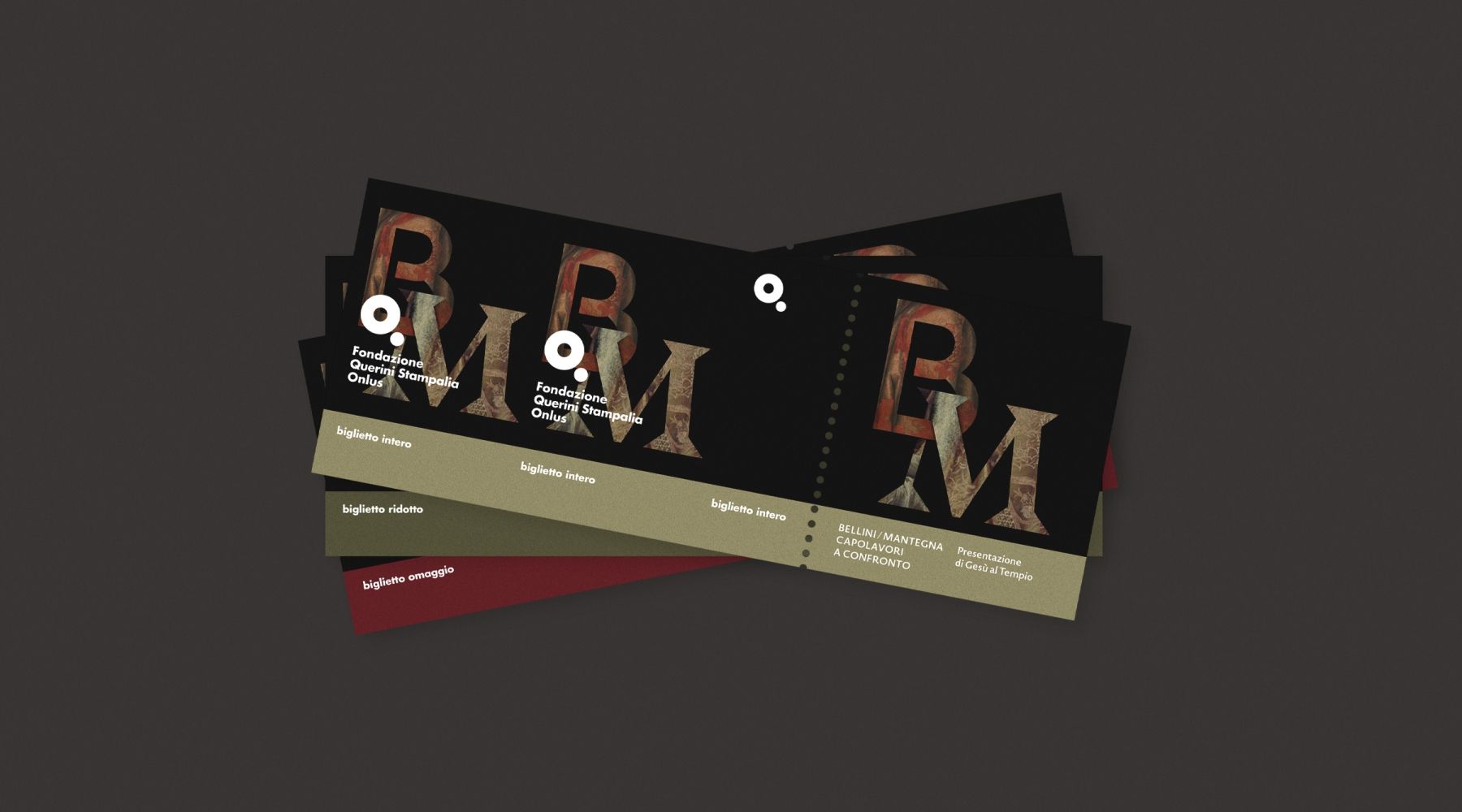
For the exhibition title, custom lettering was created by working with philologically accurate digital typefaces and adjusting the letter endings to achieve a pair of words that were very different from each other, yet compatible and complementary.
Two similar or identical works?
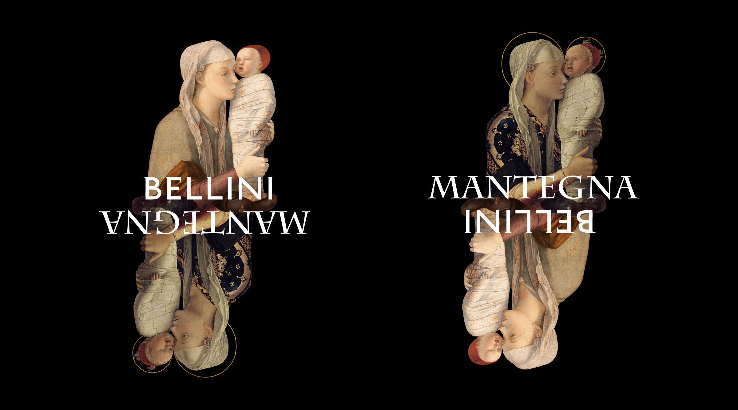
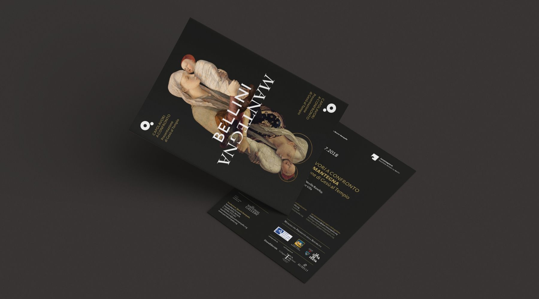
The theme of the exhibition is the comparison between the two versions of the Presentation of Jesus at the Temple. With the graphics, we emphasized this similarity by isolating the two main figures, trying to make the two subjects almost indistinguishable.
Mirror-image composition
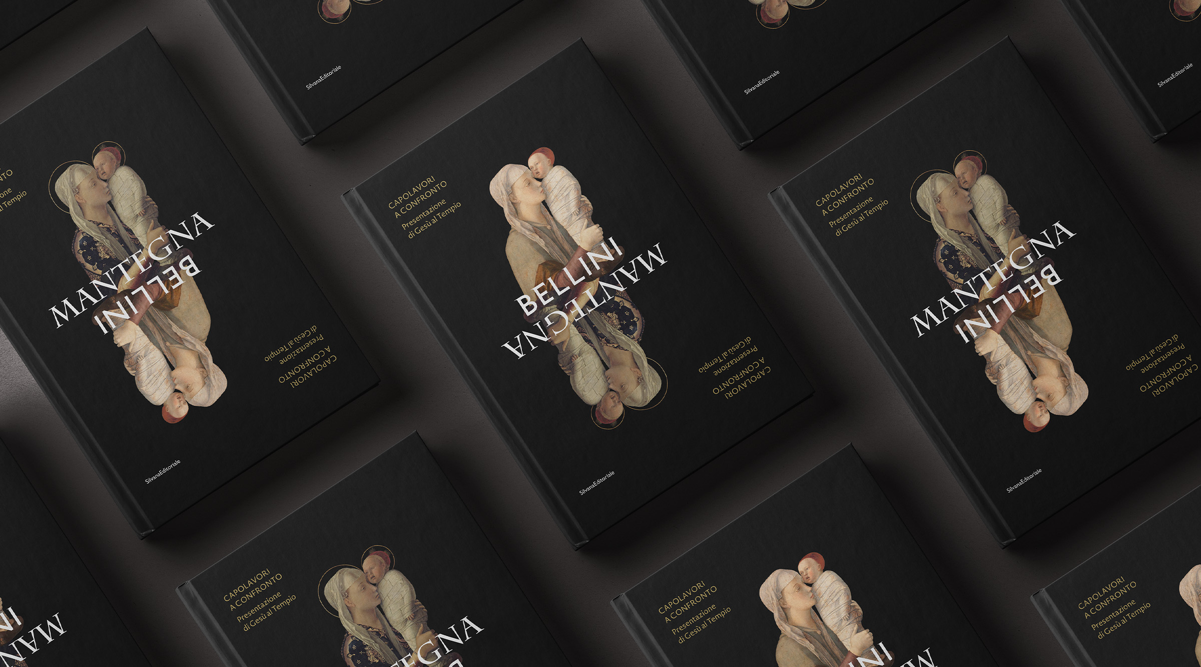
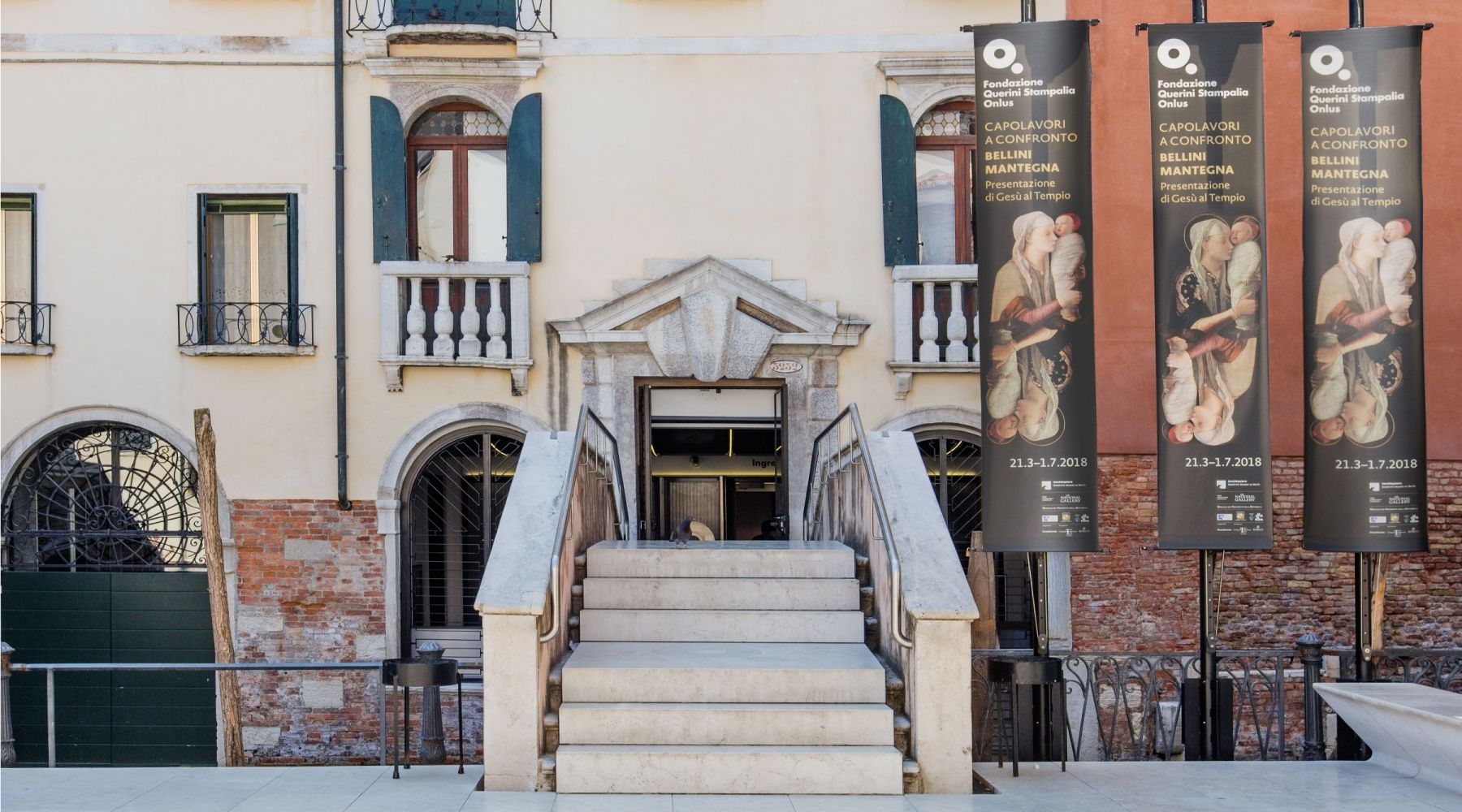
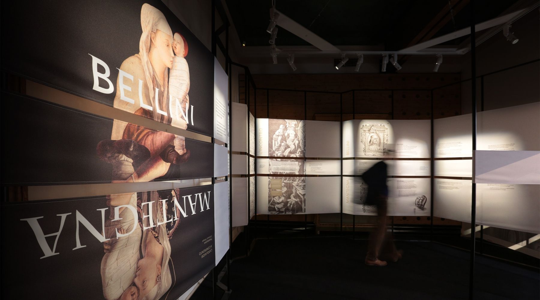
The exhibition image is made up of the two figures and the two painters' names, composed in mirrored form so that it can be rotated to obtain two versions of the same poster.
PROJECT CREDITS
Exhibition project management
We Exhibit
Communication design team
Studio Visuale
Daniele Balcon, Tommaso Lodi
Exhibition setup design team
We Exhibit
Nicolas Petit D'Oronzio, Linda Valtancoli